Client • Saysh — 2020-21
Talent and President of Saysh: Allyson Felix
CEO&CMO of Saysh: Wes Felix
Creative Director: Bernise Wong, Harry Peacham
Product Creative Director: Natalie Candrian
Head of Product: Tiffany Beers
Advisor: Drieke Leenknegt
Brand Identity — Saysh
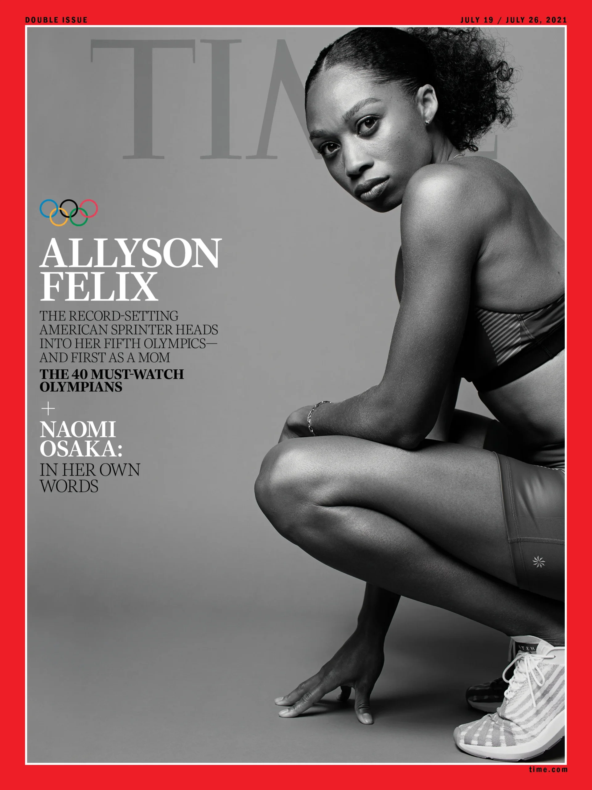
In 2019 Allyson Felix left Nike, after she was denied maternity protection. By the Tokyo 2020 Olympics, she had no footwear sponsor. Finding no brand that would align to her high standards of equality - Allyson and her brother, Wes, created her own brand - Saysh.
In designing such a purposeful brand, we looking to Allyson, the founder, who is a font of inspiration. “Graceful” is how every sports commentator described Allyson’s style of racing, and she had proven her grace on and off the track over two decades to become the most decorated track and field athlete of all time.
Our responsibility as designers was to capture her grace in graphic form. The central idea of the brand was “Fluid Grace”, which was a product of marrying Allyson’s running style with the meaning of the brand name, which is derived from the pronunciation of the French word seiche, which describes a wave. And Saysh was the fresh wave that the world needed.
+ Full brand book upon request.
↳
Our brand is steeped in the romance of the Californian, rustic coast. Naturally, the tidal interaction between the waves and the coast are an inspiration to us. Waves are an expression of movement, across sequence, space, and time. All combined, these elemental forces give a wave form - and that form captures so much of our brand. The visualization of sequence, space, and time have given the brand its graphic elements that construct our visual language.
Sequence: The repetition of waves, and the sequences they create inspired the brand's patterns.
Space: Where waves are and are not, the space between them informed our graphic structures, the application of white space, colors and layouts.
Time: The timelessness, that the tide feels forever, has shaped our logo construction, art direction and typography treatment.


↳
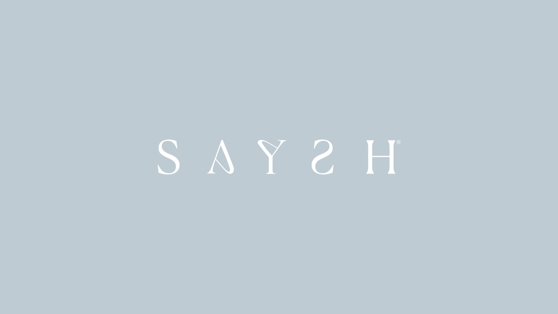
Custom Logotype:
The Saysh logotype is carefully designed with the characteristics of waves, as well as the hidden graphic motifs of timing (from thick to thin, serif to san). The soft and sharp shapes juxtapose to create a sense of movement within each letter.
--
Momentum is embedded in Saysh. With the custom logotype, the concept of space and time are embedded in the logo. The kerning between each of the characters are purposefully adjusted to 1x the size of the letter S, which is also the core element of Saysh's wave symbol. It is consciously designed within the structure of the letter "S", and "H" - where they are altered to 180 degrees.
↳
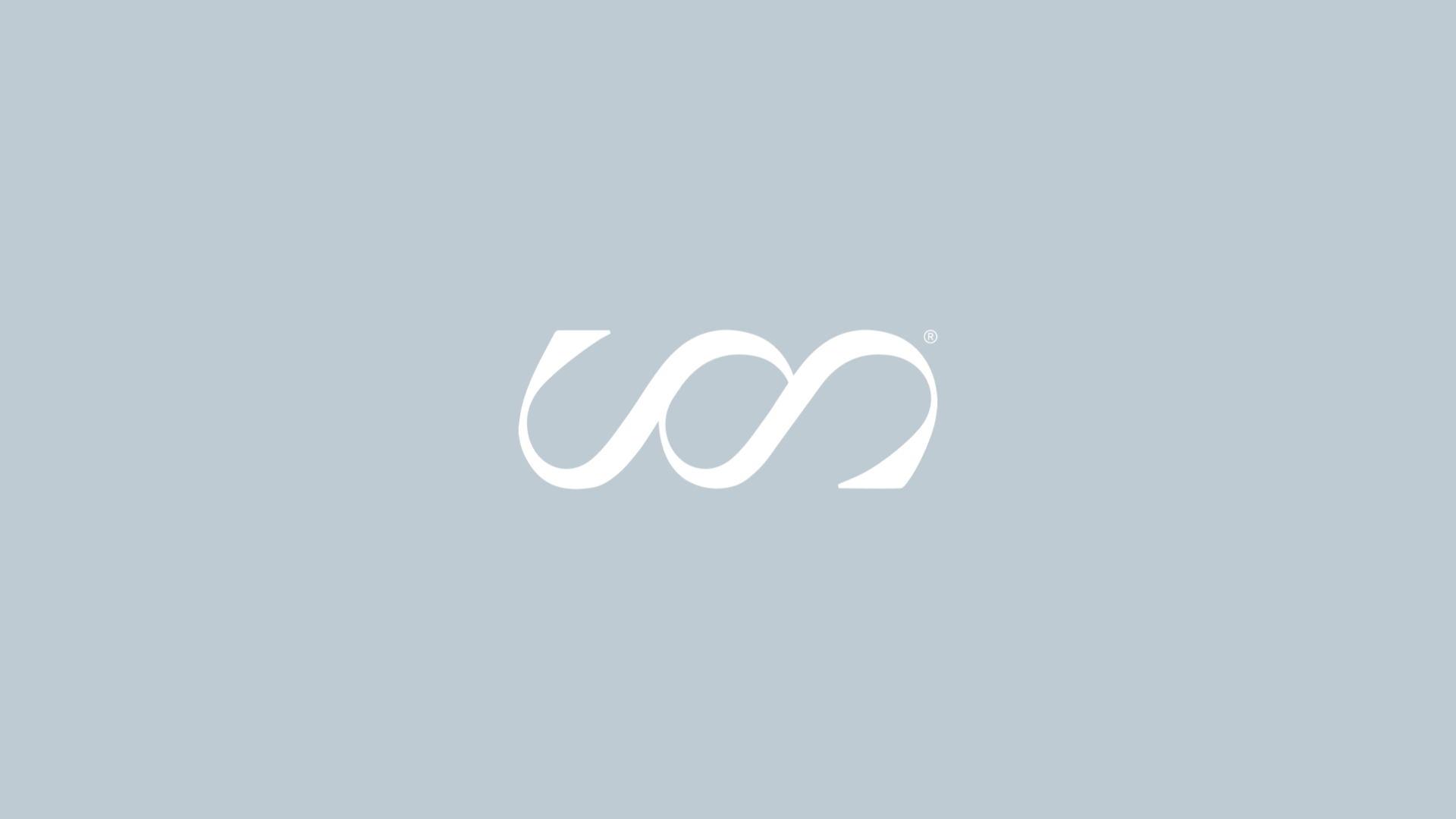
It's waves. It's also infinity.
The mark is a coming together. Two waves, perfectly balanced. It's symbolic of how our founders came together to solve a problem for their community. Again, a timelessness is evident in our mark with its similarity to the infinity symbol - a wink to the fact we're striving to build something that becomes iconic, something that ages well, and can be, perhaps, forever.





Selected Works
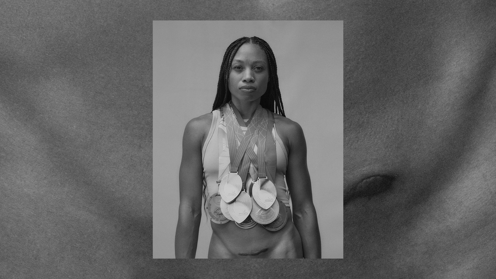
Saysh | I Know My PlaceLaunch Campaign

MoovlabBrand Identity, Launch Campaign & Digital Product

Timex AtelierCampaign Identity & Product Campaign

WM BROWNBrand Refresh & Digital Product
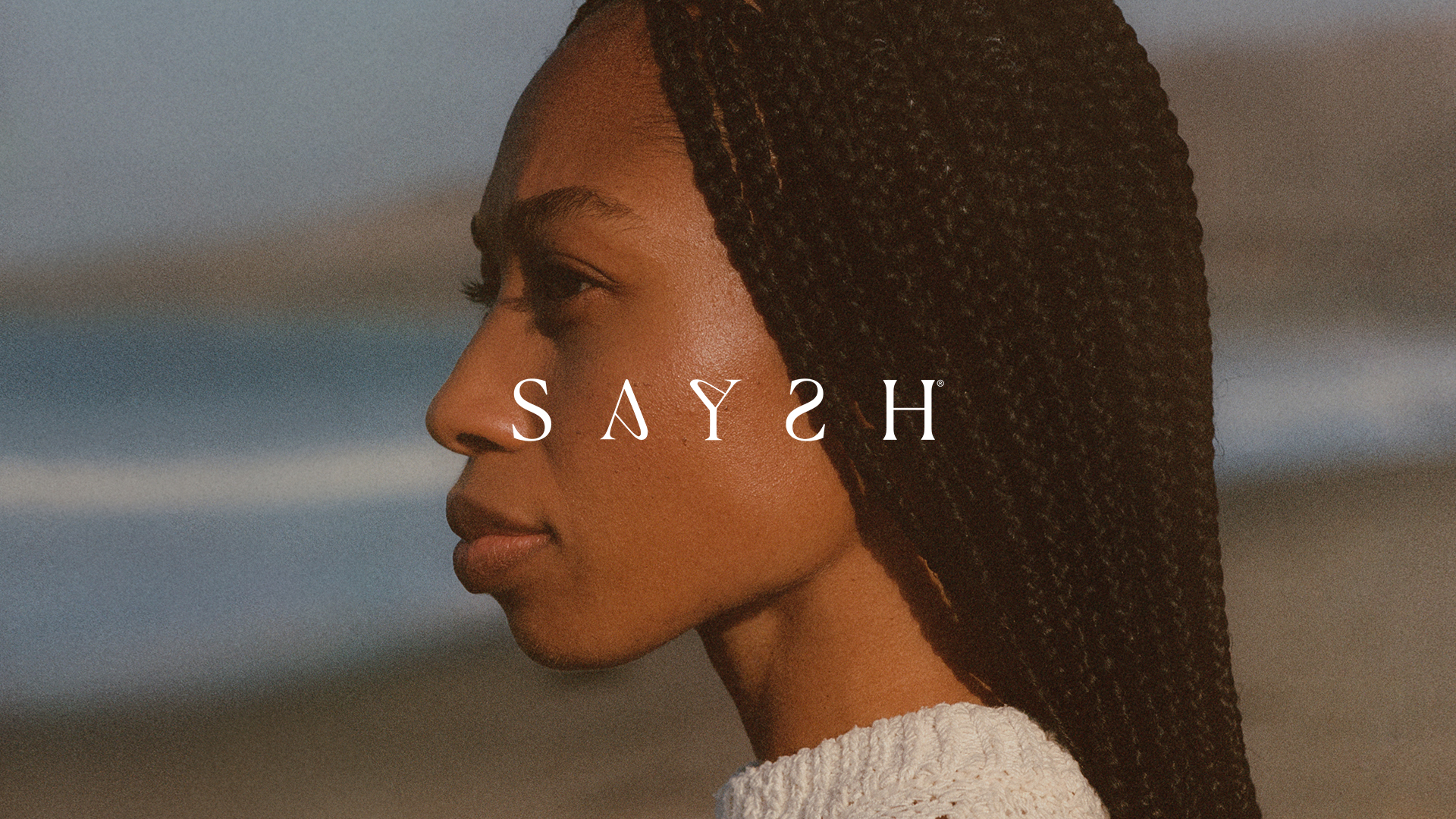
SayshBrand Identity & Ecosystem
OmorphoBrand Identity, Campaign and Digital Product Design
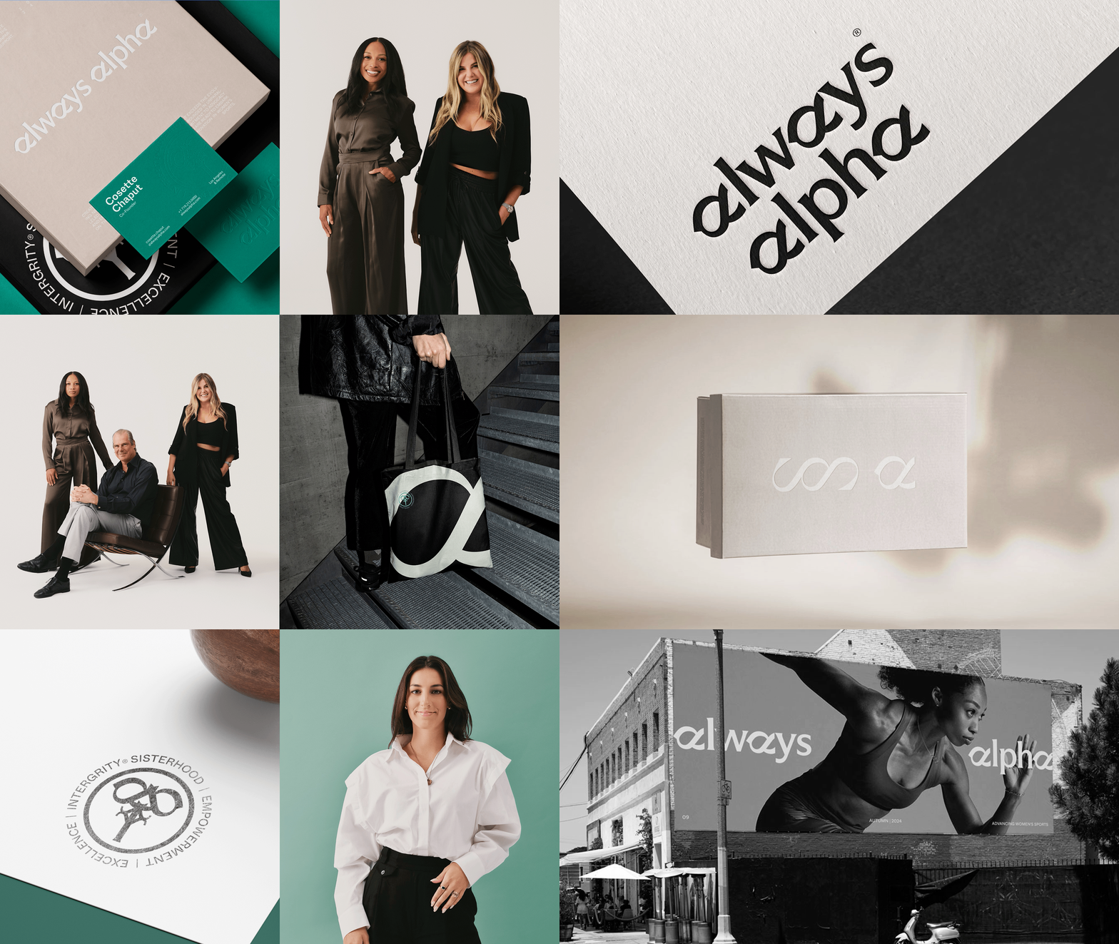
Always AlphaBrand Identity
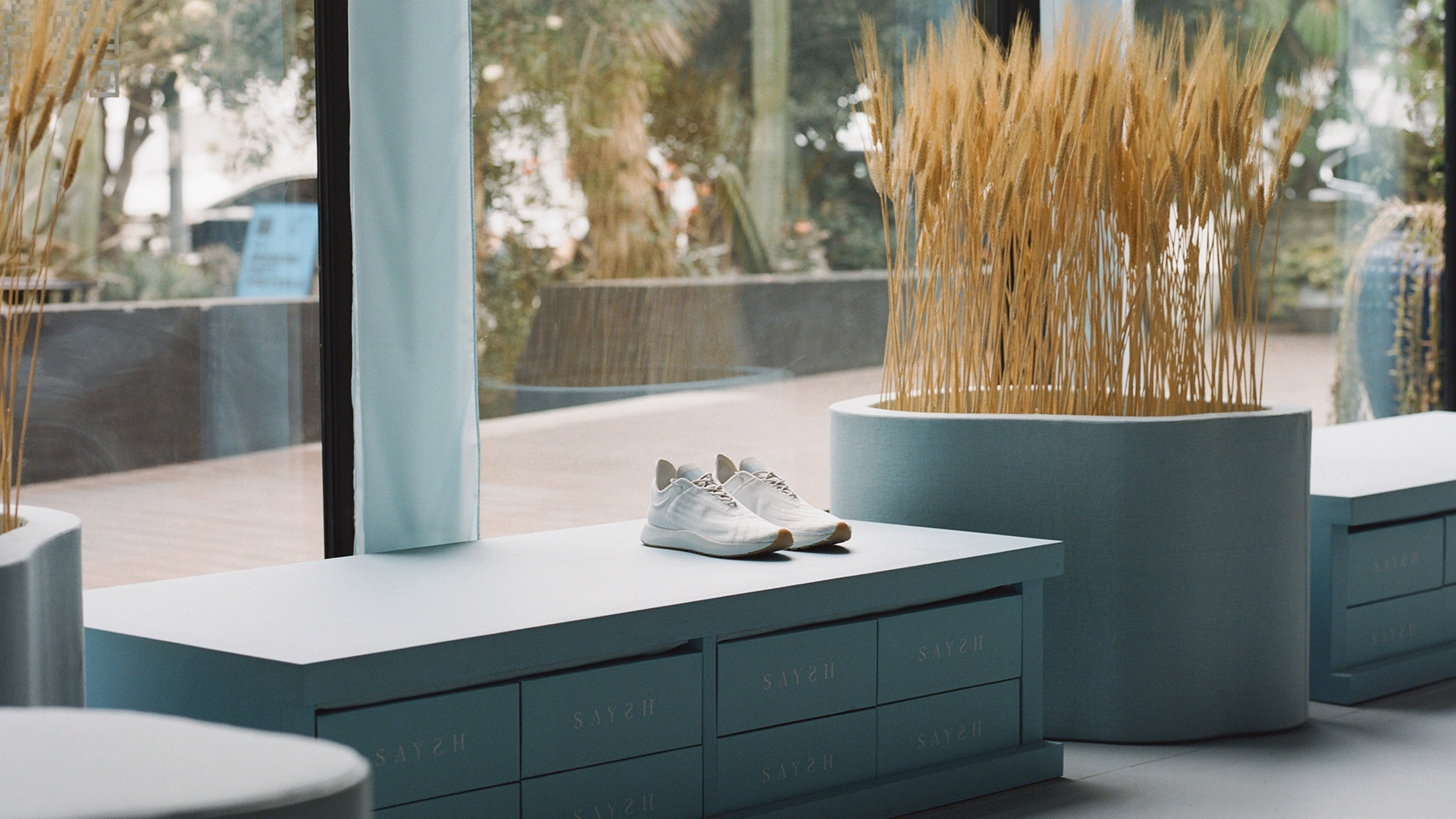
Home of SayshRetail Space & Experiential Design
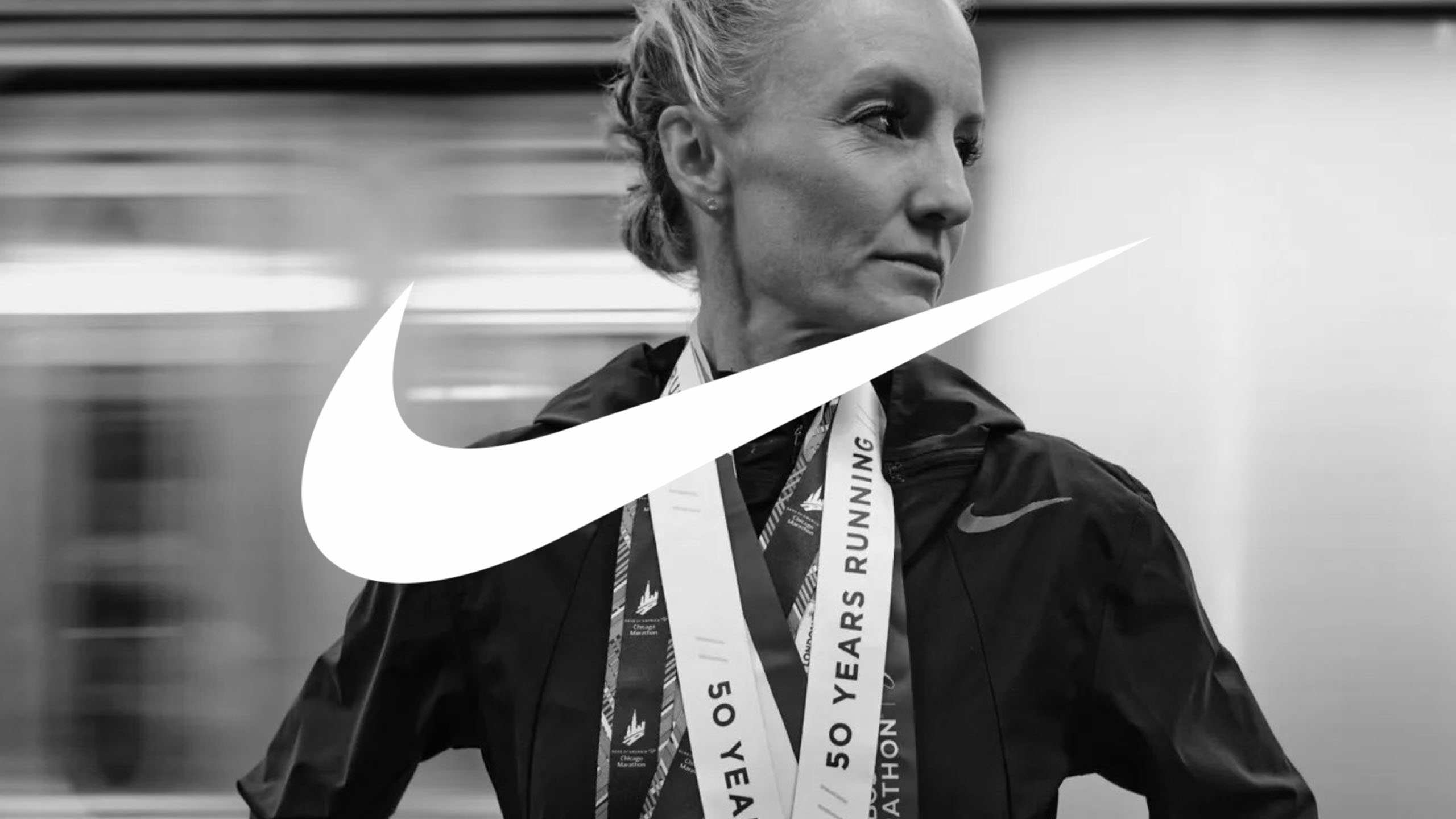
Nike NYC MarathonCampaign
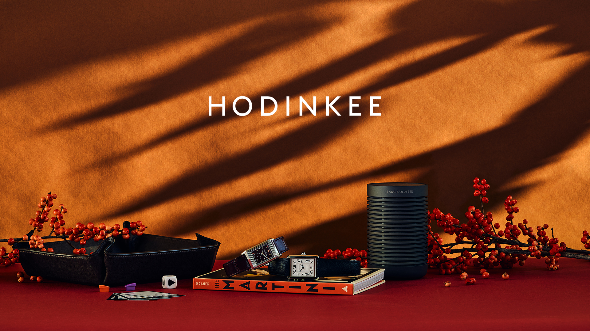
Hodinkee - Holiday CampaignCampaign & Digital Product
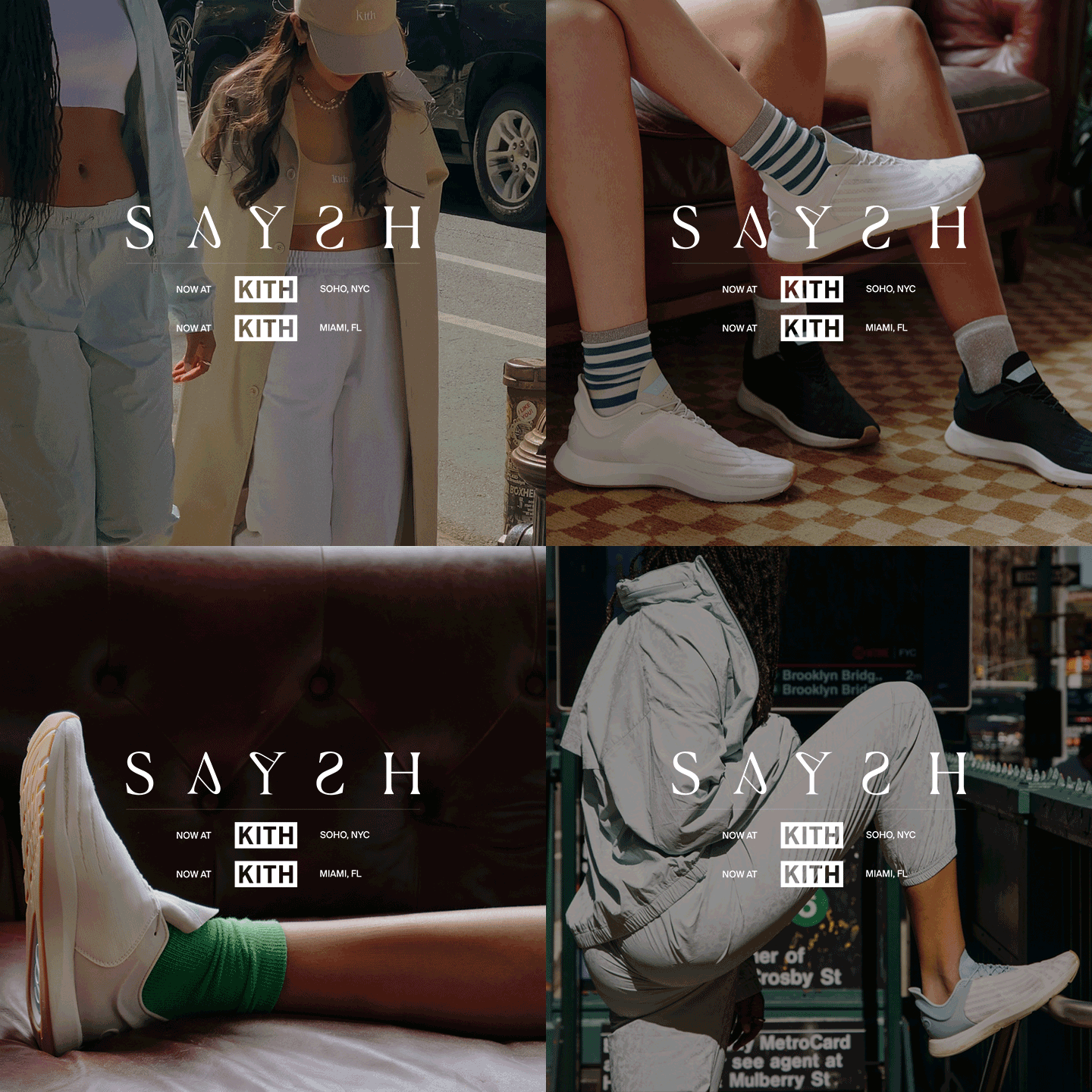
Saysh x KithBrand Partnership & Campaign

Spike 1 NFT x Saatchi GalleryCampaign & Digital Art (NFT)
GatherBrand & Product Launch

House of '98 - ESPNCampaign & Experiential Digital Design
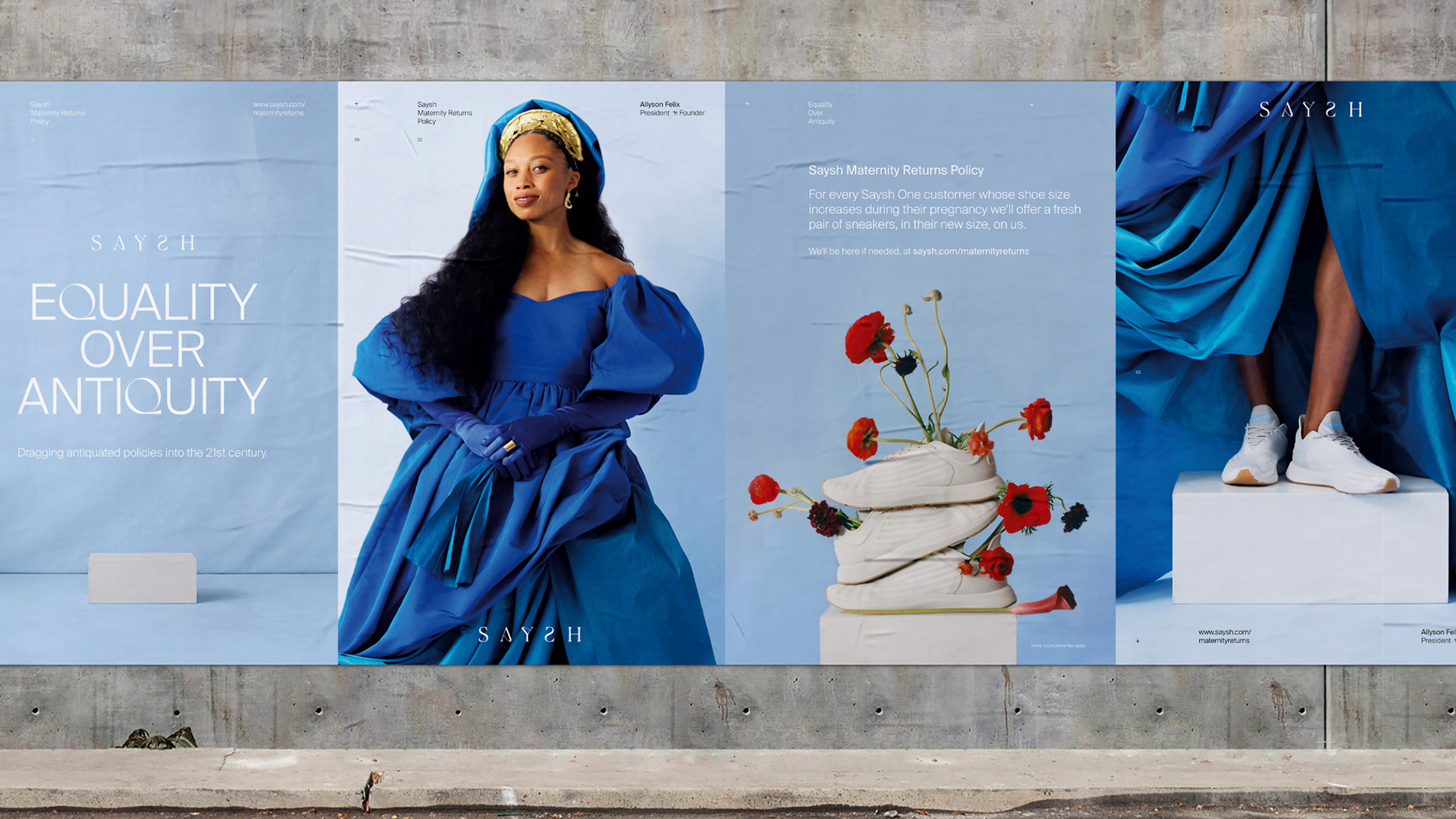
Saysh Equality Over AntiquityBrand Campaign
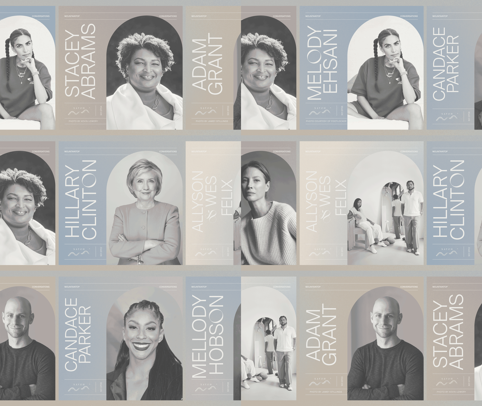
Mountaintop ConversationsPodcast Production & Identity Design

GoogleFuture Vision
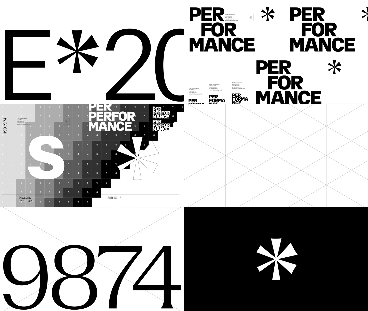
Evolved By NatureBrand Identity & Product Design
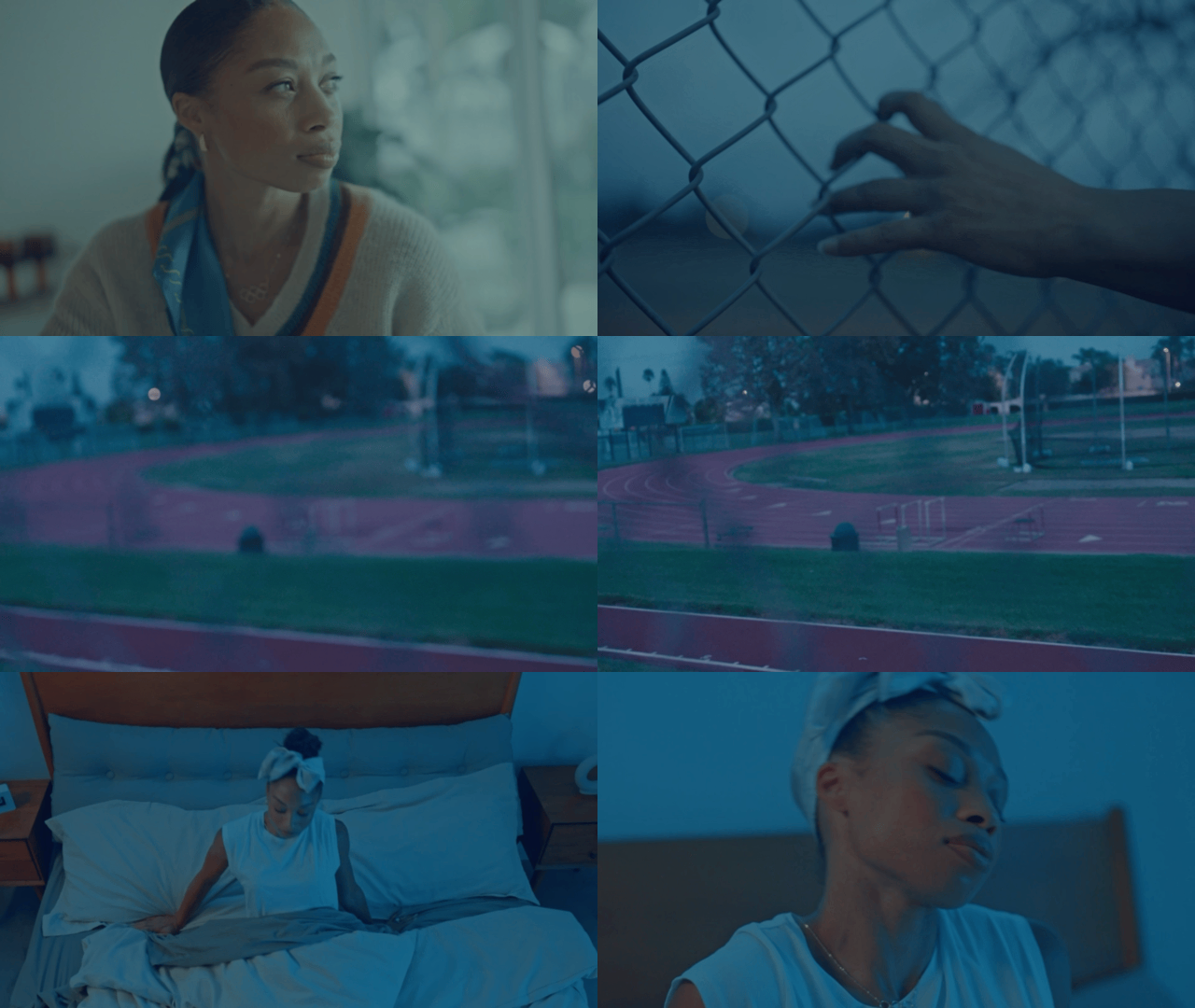
Saysh Two CampaignCampaign & Product Design

NoonBrand Identity & Packaging Design

PICIBrand Identity & Product Design
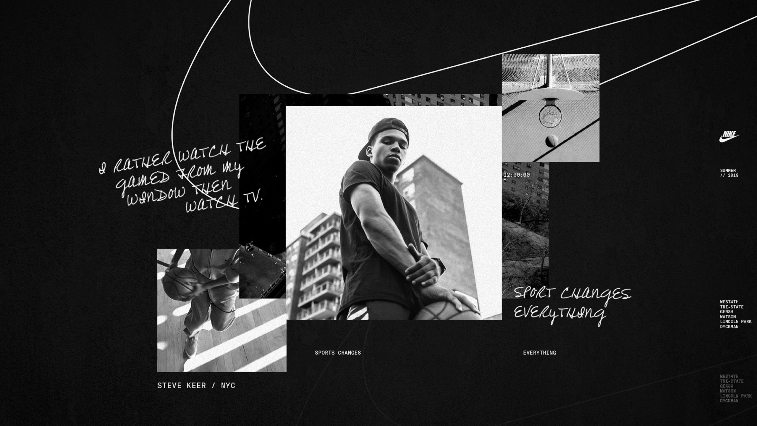
Nike x NYvsNYCampaign
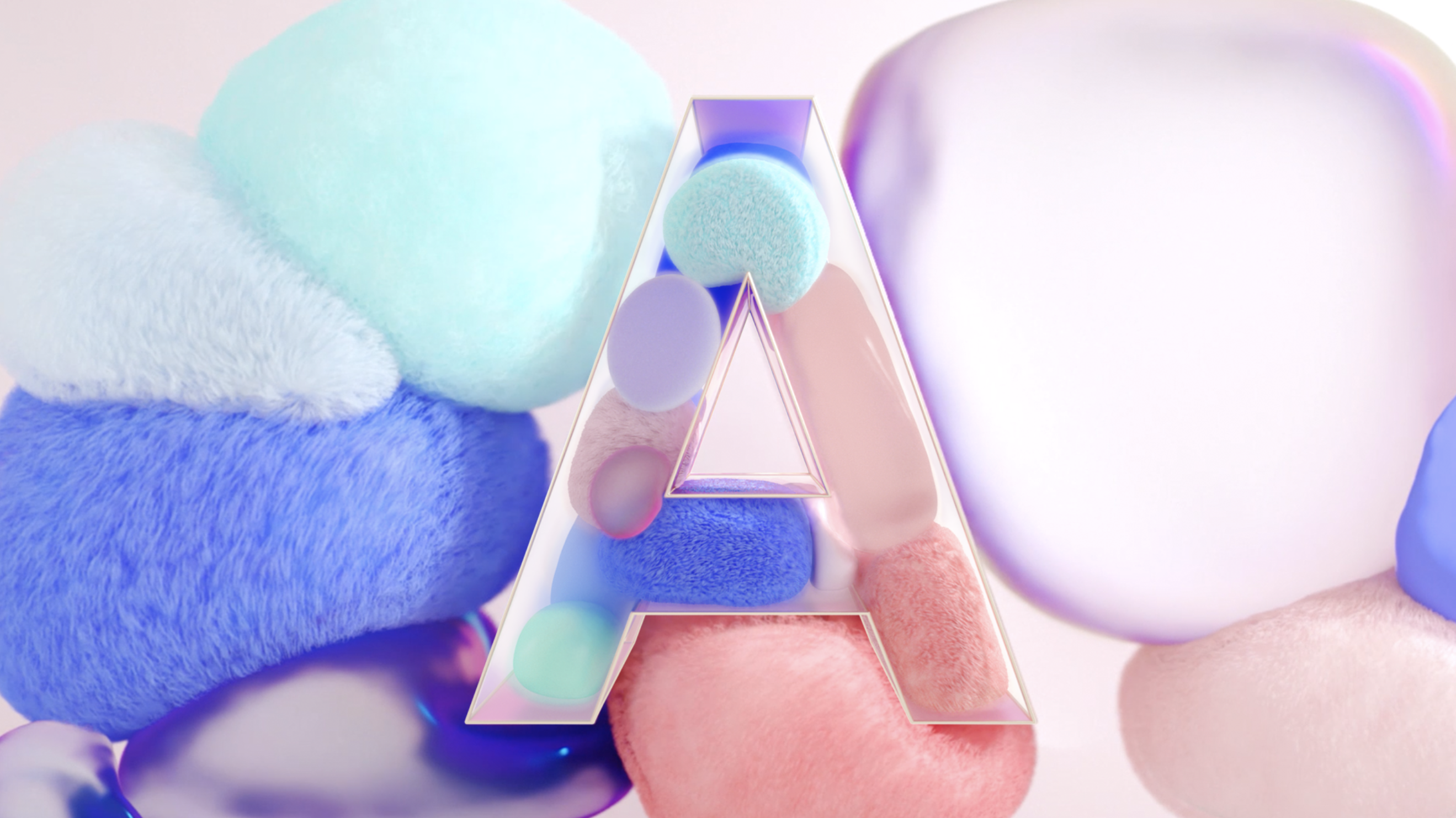
Samsung Galaxy ACampaign
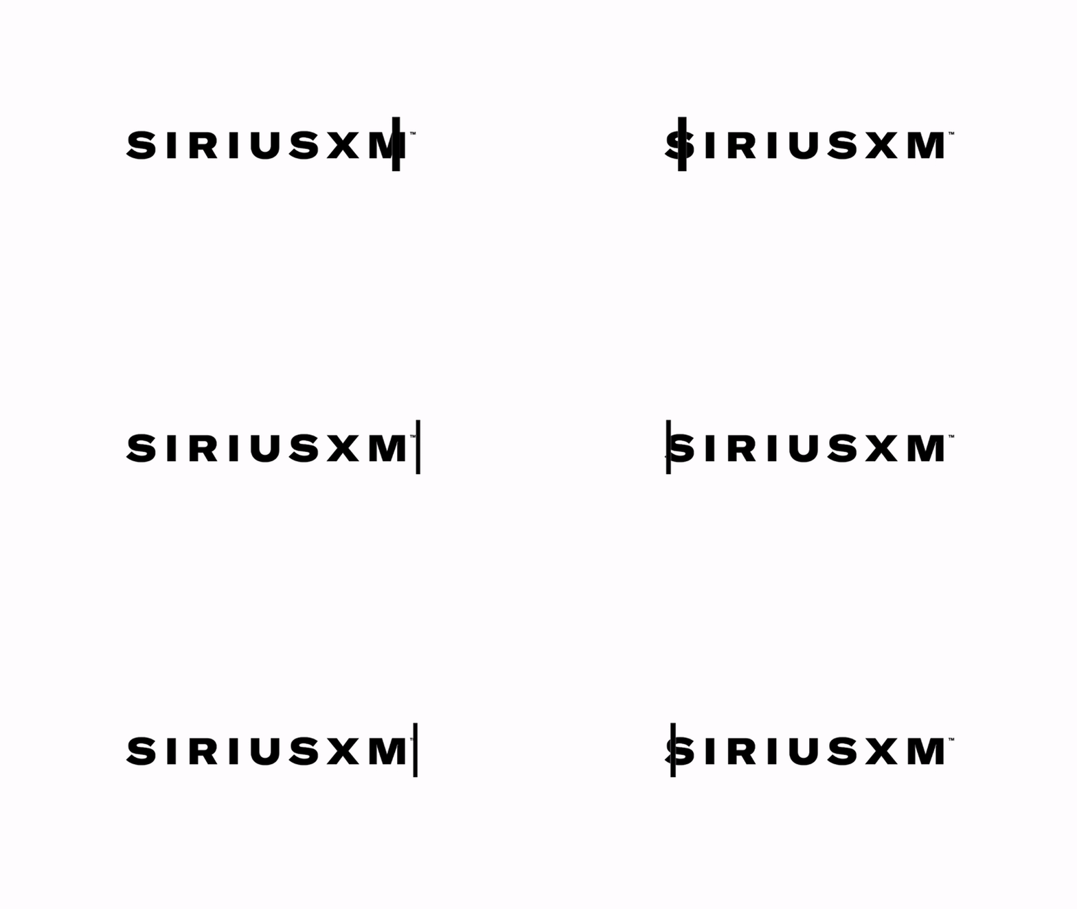
SiriusXMBrand Identity
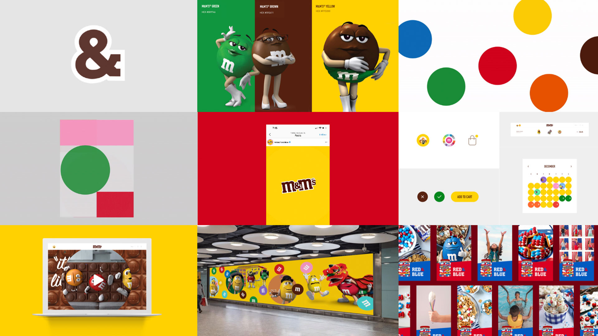
M&MDigital Ecosystem
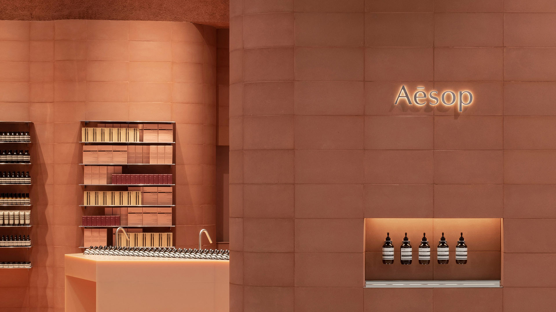
Aesop OasisProduct & Membership Design
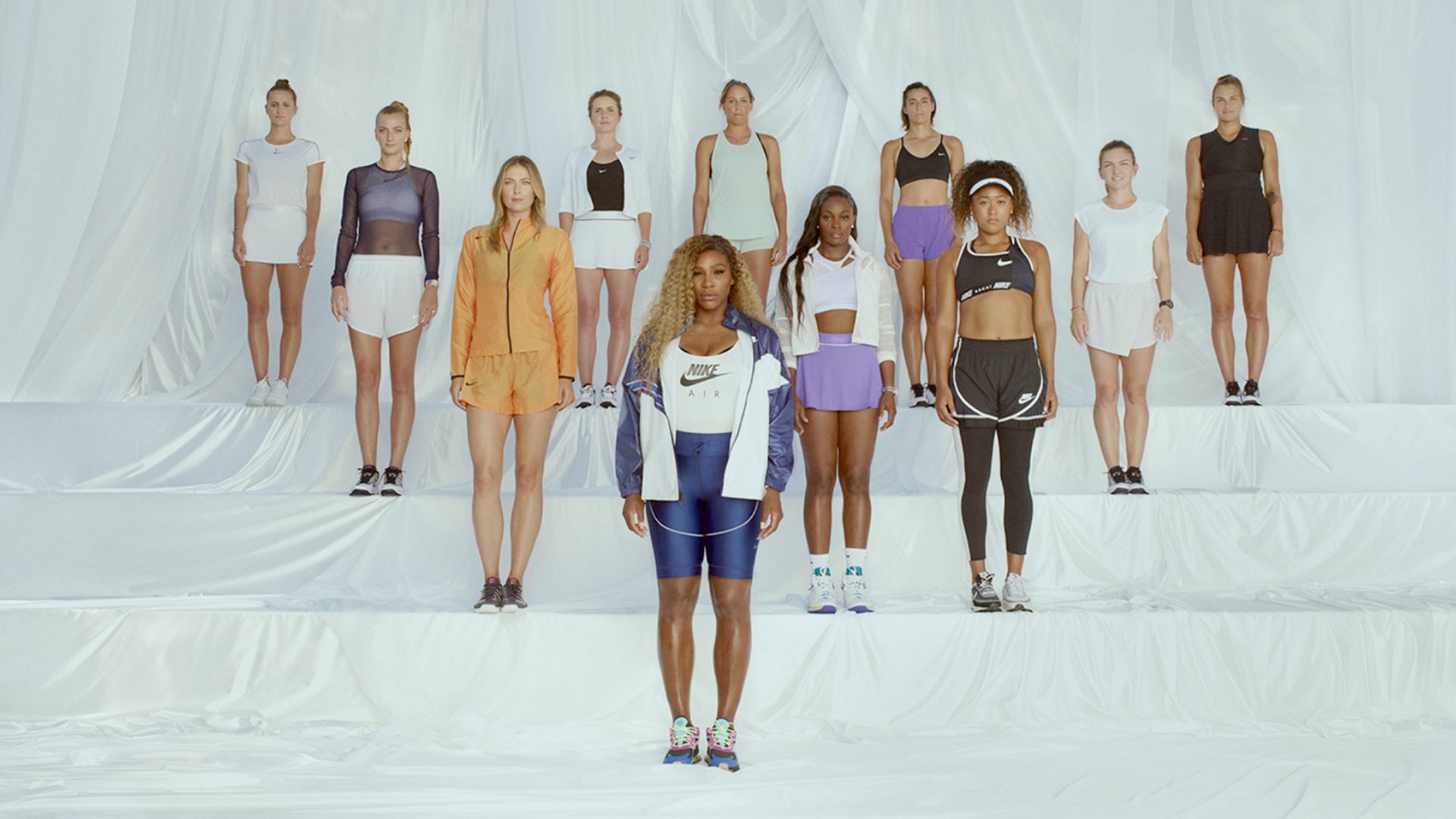
Nike x USOCampaign
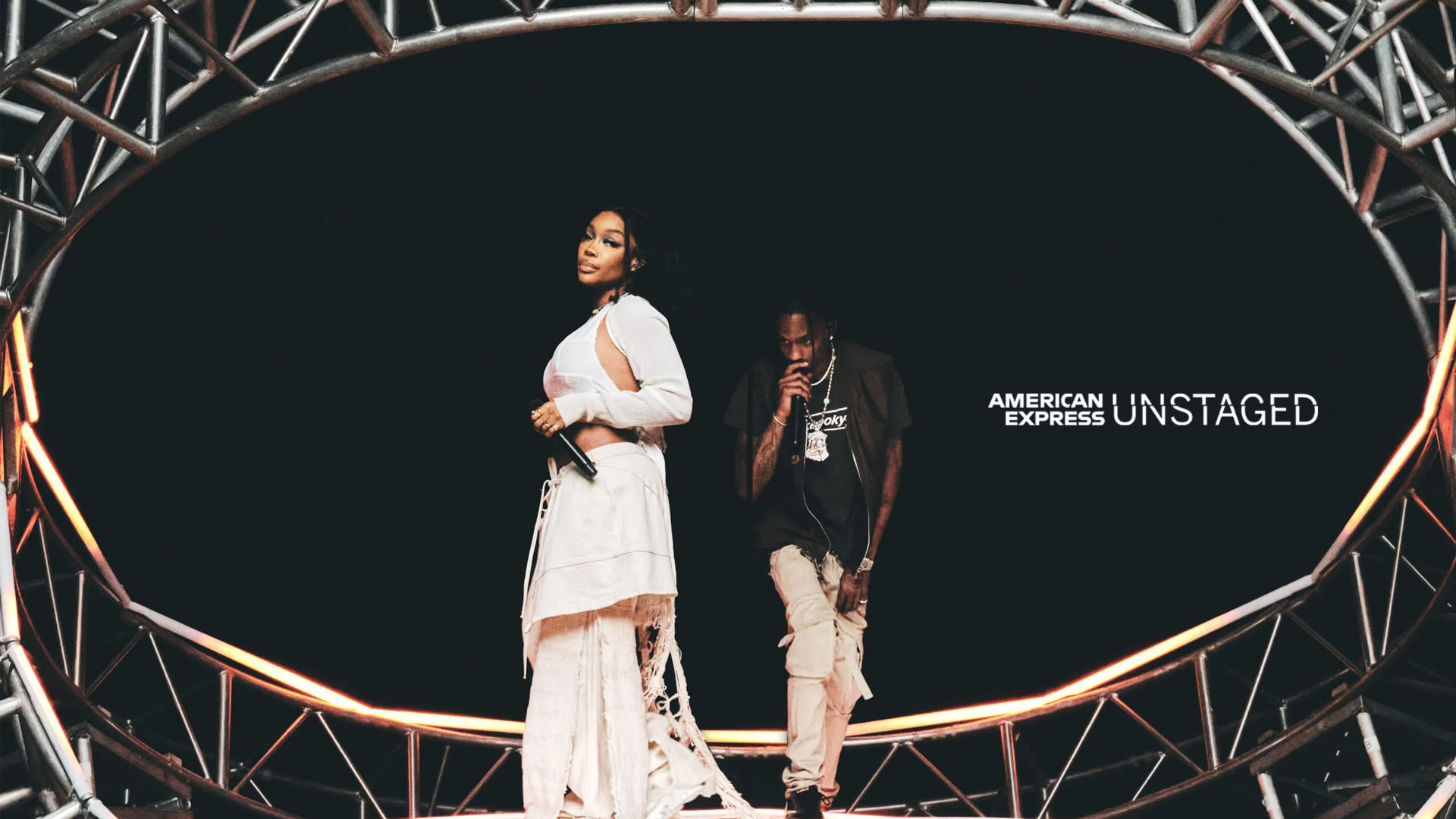
SZA — AMEX UNSTAGED ConcertLive Performance Production & Art Direction